If you need to create a chart in Excel, you've come to the right place. In this article, we'll show you how quick and easy it is to create charts in Excel, no matter what type of chart you need to create.
Before starting, it's important to remember that graphs are an excellent way to visualize and understand data in a clearer and more objective way. With Excel's features, you can create attractive, personalized charts that will impress your colleagues and clients.
Tutorial on how to create a chart in Excel
Step 1: Select data
The first step to creating a chart in Excel is to select the data you want to include in the chart. To do this, simply click and drag your cursor over the data you want to include. Make sure you select all relevant columns and rows.
Step 2: Create the chart
With the data selected, it's time to create the chart. To do this, click the “Insert” tab at the top of the screen and select the type of chart you want to create in the “Charts” section. There are several types of charts available, including column charts, line charts, pie charts, and more.
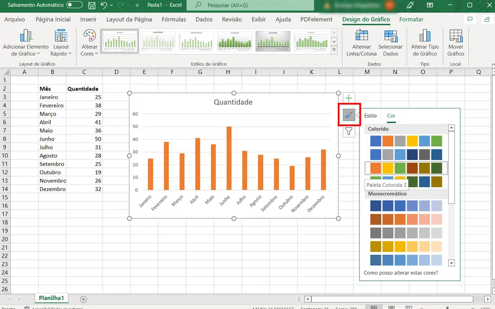
Step 3: Customize the chart
Once the chart is created, you can customize it according to your needs. There are several options available, including adding titles, legends, axis labels, and more. To customize the chart, simply click on it and use the tools in the “Design” tab to make the desired changes.
Step 4: Save the chart
Finally, it's important to save the chart so you can use it again in the future. To save the chart, simply right-click on the chart and select the “Save as image” option. This will allow you to save the graphic to your computer in several different formats, including JPEG and PNG.
See too!
- Free job search apps
- Applications to block unknown calls
- The best coupons, discounts and offers apps
In short, creating a chart in Excel is quick and easy, no matter what type of chart you want to create. With the features and tools available in Excel, you can create attractive, personalized charts that will help you visualize and understand data in a clearer and more objective way. We hope this article was helpful and that you have success creating your own charts in Excel.